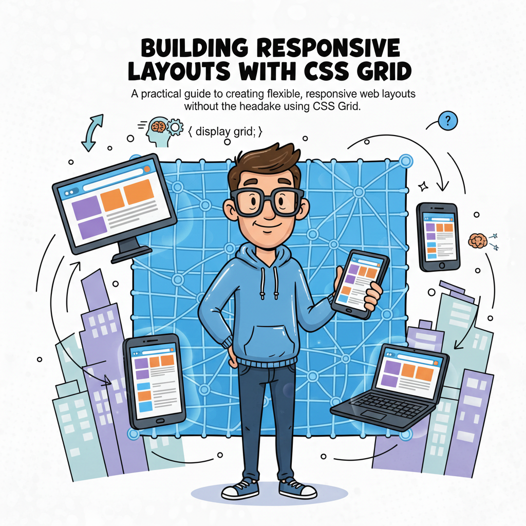
Building Responsive Layouts with CSS Grid
The definitive guide to modern, headache-free web design.
The evolution of web design has reached a pinnacle with CSS Grid Layout. For years, developers struggled with float, inline-block, and the limitations of flexbox when it came to two-dimensional structures. CSS Grid isn't just a new property; it’s a paradigm shift that allows us to define both columns and rows simultaneously.
1. The Anatomy of a Grid
To master Grid, you must visualize the Virtual Framework. Unlike Flexbox, which is content-out, Grid is layout-in. You define the paths, and the content follows.
The Grid Container
The parent element where display: grid lives. It creates the Grid Formatting Context for all direct children.
The Grid Lines
The horizontal and vertical dividers. You can name these lines to position items with surgical precision.
2. Explicit vs. Implicit Grids
One of the most common "headaches" is understanding why items appear where they do. CSS Grid handles overflow through the Implicit Grid.
- Explicit Grid: Defined by you using
grid-template-columnsandgrid-template-rows. - Implicit Grid: Created by the browser when content exceeds the defined tracks. You can control this using
grid-auto-rows.
.layout {

 display: grid;

 grid-template-columns: repeat(3, 1fr);

 grid-auto-rows: minmax(100px, auto); /* Ensures rows are at least 100px */

 gap: 1.5rem;

}
3. Advanced Responsive Logic
Modern layouts shouldn't rely on hundreds of media queries. CSS Grid introduces functions that calculate space dynamically based on the viewport.
The minmax() Function
This function defines a size range. For example, minmax(200px, 1fr) ensures a column never shrinks below 200px but expands to fill all available space if the screen is wide.
Auto-Fill vs. Auto-Fit
This is where the magic happens for "No-Media-Query" responsiveness:
FeatureAuto-FillAuto-FitEmpty TracksKeeps empty tracks as visible space.Collapses empty tracks to zero width.Best Use CaseCreating a rigid grid regardless of content.Creating a centered, gallery-style layout.
4. Mastering Grid Template Areas
This is arguably the most "visual" way to code. It allows you to literally map out your page in your CSS file. It makes maintenance incredibly easy—if you want to move the sidebar, you just move the word "sidebar" in your code.
"Grid Template Areas transform CSS from a styling language into a blueprinting tool. It bridges the gap between design mockups and production code."
Imagine a standard dashboard. With Grid Areas, the mobile-to-desktop transition looks like this:
grid-template-areas: "header header" "nav main" "footer footer";
5. Precision Alignment
Centering a div was once the industry's biggest joke. With Grid, it's one line. But Grid offers more: Self-Alignment and Content-Alignment.
- 🎯 justify-items: Aligns items along the row (horizontal) axis.
- 🎯 align-items: Aligns items along the column (vertical) axis.
- 🎯 place-items: center; The shorthand to center everything perfectly in both directions.
Conclusion
CSS Grid is no longer "the future"—it is the present. By shifting your mindset from single-axis alignment to full-page coordinate systems, you unlock a level of creative freedom that was previously only possible with heavy JavaScript libraries or rigid frameworks like Bootstrap. Start small, experiment with the fr unit, and watch your layouts become more resilient and fluid than ever before.